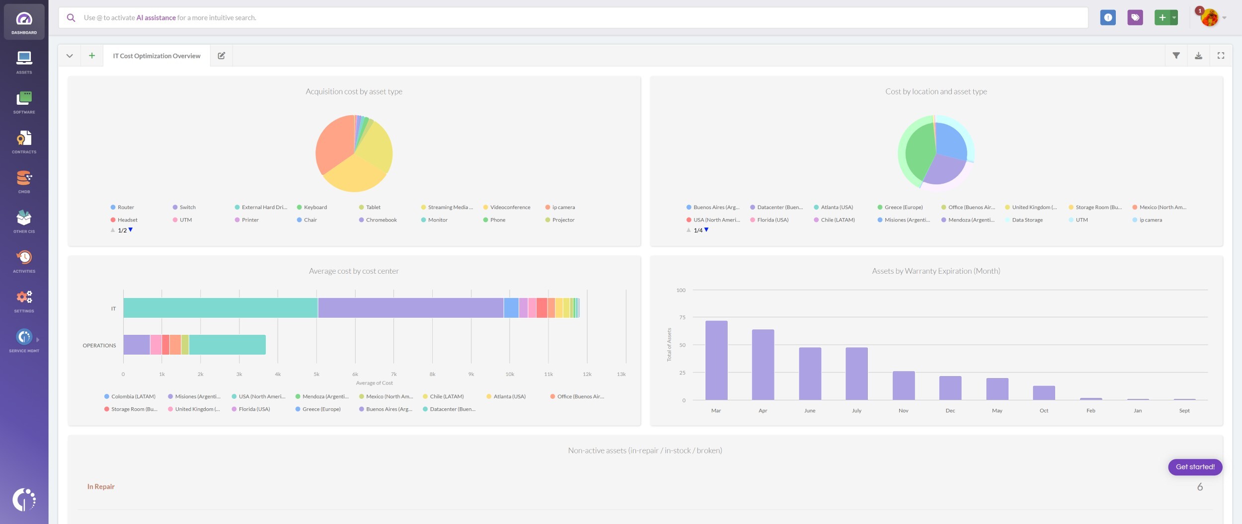
How to create a warranty status dashboard
A warranty status dashboard gives you a clear view of your IT assets’ coverage. It helps you make the most of your warranties, renew them before they expire, and evaluate their cost-effectiveness.
With InvGate Asset Management, creating a warranty dashboard is simple. There are many charts you can include in your dashboard but we suggest starting with the following:
- Warranties expiring soon.
- Items in warranty cycle.
- Warranty status by location.
- Stock levels.
- Computers by status.
- Assets repaired once.
- Assets cost by location.
How to build a dashboard to manage warranties

Building a custom dashboard in InvGate Asset Management makes it easy to track the warranty status of all your IT assets in one view. With just a few charts, you can identify upcoming expirations, plan renewals, and keep surprise costs under control. Here’s how to do it:
- Go to Dashboards.
- Click the “+” icon to create a new dashboard.
- Fill in the basic details and the global filters:
- Name: Warranty Dashboard.
- Description: Track warranty status, upcoming expirations, cost-effectiveness.
- Leave global filters empty (owner, location, and tags) so you get full visibility.
Once you’ve completed the basic dashboard details, you can add the charts we mentioned above. Here’s how.
#1. Warranties expiring soon
- Click Add Chart to create your next chart:
- Visualization: Columns stacked.
- Metric: Assets (Tracked - Total)
- Dimension: Warranty Expiration (Quarter) and Warranty Expiration (Month).
- Add the following condition:
- Assets > Warranty expiration year > is > 2025.
- Name it “Warranties expiring soon” and click Save.
#2. Itens no ciclo de garantia
- Click Add Chart to create your next chart:
- Visualization: Bar stacked (can also be Column stacked).
- Metric: Assets (Tracked - Total).
- Dimension: Warranty Status and Location.
- Name it “Assets by warranty cycle” and click Save.
#3. Warranty status by location
- Click Add Chart to create your next chart:
- Visualization: Bar stacked.
- Metric: Assets (Tracked - Total).
- Dimension: Location and Warranty Status.
- Name it “Assets by warranty cycle” and click Save.
#4. Stock levels
- Click Add Chart to create your next chart:
- Visualization: Column stacked.
- Metric: Assets (Tracked - Total).
- Dimension: Location and Warranty Status.
- Name it “Stock levels” and click Save.
#5. Computers by status
- Click Add Chart to create your next chart:
- Visualization: Column stacked.
- Metric: Assets (Tracked - Total).
- Dimension: Status.
- Add the following condition:
- Assets > Type > is > Computer.
- Name it “Computers by status” and click Save.
#6. Assets repaired once
Our platform comes with plenty of variables to build meaningful charts about your assets’ status. But if you need to track something more specific, you can always create a custom field — for example, tagging assets that went through a warranty repair. Here’s how to do it:
- Go to Settings > CIs > Fields.
- Click Add to create a new asset field and fill in the following details:
- Name: Warranty repair.
- Description (optional): Use this field to tag assets that have undergone a warranty repair.
- CI type: Asset.
- Asset types: All assets.
- Field type: List.
- Required field: Not required.
- Sort by: Manual.
- Multiple selection: Disable multiple selection.
- Add the following values:
- Warranty repair (1st repair).
- Warranty repair (2nd repair).
- Warranty repair (3rd repair or more).
- Click Save.
- Click Add Chart to create your next chart:
- Visualization: Column stacked.
- Metric: Assets (Tracked - Total).
- Dimension: Location and Status.
- Add the following condition:
- Warranty repair > is > Warranty repair (1st repair).
- Name it “Assets repaired once” and click Save. Note: You can repeat this process for the other two asset types (repaired twice, and repaired three or more times). You can also create a single chart that shows all three categories together.
Now go back to the dashboard you created at the beginning of the instructions and add the following chart:
#7. Assets cost by location
- Click Add Chart to create your next chart:
- Visualization: Column stacked.
- Metric: Cost - Total.
- Dimension: Type and Location.
- Name it “Assets cost by location” and click Save.